
This past January marked 5 years in business for me, and I was feeling a little tired of my then-current branding. I’d outgrown what it was, and was ready to move into something a little more ‘me’. A brand that truly meant something to me, spoke to who I was and better represented my business. I was very fortunate to have an incredibly talented designer in my corner and we spent a lot of time talking about colors, meanings, fonts and web design. For the past three months or so, it has been an ongoing process to get this brand to what you now see today. And I couldn’t be more excited to unveil it to you!
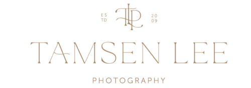
When it came to my brand, I’ve always been hesitant to use something simple or obvious as an element in my logo. However, I did have a long checklist of likes and dislikes. I wanted a clean and classic look, but with a trendy feel. I absolutely didn’t want anything someone else might have… It had to be original. It had to have deep, significant meaning to me. I did not want anything obvious like a camera, baby, tree or heart. The very first concept presented to me absolutely took my breath away but it didn’t work for me as a very good friend already uses a similar symbol. And so a long and intense thought process began. What you now see as a crown emblem above my logo represents quite a few things to me. The crown represents my God, Father in heaven. He is the KING and the foundation of my life. The little ones I am blessed to photograph are each his children, princes and princesses. The 5 points represent my loves- Greg, Kyara, Eden, Kingston and Zion. The diamond shapes are an awesome graphic element, done in watercolor to create softness. But there is more meaning to this single element. The crown shape is also surprisingly similar to the shape of an opening magnolia bud. In our backyard we have a gorgeous magnolia tree that shows its incredible beauty to us each spring. And so this single shape also reminds me of our home, waking up to the blossoming tree covering our bedroom window and breathing in that fragrant scent through the windows. Each spring it blooms, bringing with it new life. And again, the circle closes, as it reminds me of the new life I am so fortunate to photograph.
The brand colors and the watercolor element are not just a happy coincidence. In everything brought to my branding, there HAD to be a meaning behind it. The colors are all found at the beach, in the water, the sand and the sunset. The gold of the crown reminds me of the glorious light I love to photograph in the few hours before sunset. As one of my favorite places to photograph and a reminder of my childhood growing up along the coast of Australia, this rounded out my overall brand. Coming to this conclusion was absolutely thrilling. It was perfect!
Many thanks to my wonderful, amazing, patient and hard working friend who tirelessly worked with me to create this brand and my web presence. Although we have never had the pleasure of meeting in person, you inspire me in so many ways. I’m forever indebted to you, not just for this, but for your wonderful friendship. XO

Congratulations Tamsen! It is beautiful and I love all the special meanings of everything!
thanks so much Kelly!
Tamsin, as a graphic designer I am thoroughly impressed with your bold, clear and original thoughts and process that you took to come up with something completely new and you! Congrats and I think it is stunning!
So gorgeous!! I love the crown, and the colors are perfection! Amazing amazing job!
Sensational! A beautiful idea 🙂
Thanks Ashley! It means so much more to me, having put in so much meaning and personal reflections of my life. I’m so thankful to have this done!
Wow! Beautiful!